Home Home

Work Work

Bio Bio

Resume (external link) Resume

Home
Home

Work
Work

Bio
Bio

Resume (external link)
Resume

Published Case Study.

Duolingo UX.

Stepping Stones of Gamified Language Learning - A UI/UX case study determining pain points of active and past users and how to turn them into motivational aspects.

The basic idea of “gamification” is the use of game elements in a non-gaming environment. The designer uses the elementary structure of video games, but out of the context of an actual video game. Duolingo wants to encourage users to learn a new language in a playful way.
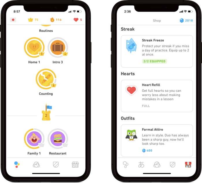
The lesson-based structure allows users to tackle areas of interest after completing the introductory lessons to gain a solid foundation. The learner can progress at his/her own pace and set goals by completing one lesson, ranging from 10 experience points (XP) to 50XP per day. Every completed lesson earns XP and in-game currency, which the player may redeem for power-up items.
User Pain Points and Problem Solving

For a recent academic project, I explored the effectiveness of gamification in an educational context. To that end, I researched existing on-market products that use gamification for educational purposes. Duolingo was the most prominent example in this category in the field of language learning.
 
Based on conducted user experience (UX) research and empathy interviews, the author decided to revise some of the features to improve the overall learning experience of the Duolingo app. A special focus of this research was active Duolingo users and users that stopped using Duolingo before making significant progress (Duolingo compares 35h to 1 semester of university classes). Below is a list of frequently mentioned pain points of\from the interviewees, and a possible solution to each of them:

Pain Point #1
“I am afraid to fail the lesson because I make too many mistakes.”

During the lesson, the app provides instant feedback (correct or incorrect answer). This is an essential feature to recognize and subsequently avoid error patterns. However, the app does not permit the learner to immediately self-correct and explore the error made. It simply moves on to the next question instead. At the start of each daily session, the user has five lives available, and for every instance of a mistake, a life is deducted. Once the user makes five mistakes during the lesson (losing five lives resulting in being locked-out unless buying themselves out with in-game currency), they fail the entire lesson.
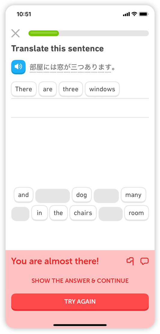
Improving Duolingo’s grading system by allowing instant corrections and maintaining the game aspect: The user only loses a life when selecting that the answer be displayed, but not for the wrong answer when self-corrected.

The error screen uses motivational language to encourage the user. The prompt simultaneously presents two actions: The primary action is to “try again” infinitely by returning to the question for self-correction until the answer is correct. The secondary action is to display the correct answer when the user is stuck, and to move on to the next question; in this scenario, the user loses a life.
Pain Point #2
“I just want to learn basic speaking and reading for my next trip, but I don’t want a serious commitment to the language at this point.”

The intent to learn a new language is a decision that asks for a big commitment by the learner. Not every learner is willing or ready for it, yet many people want to learn at least a few words and phrases for a trip to a foreign country, as they consider it an important travel preparation.

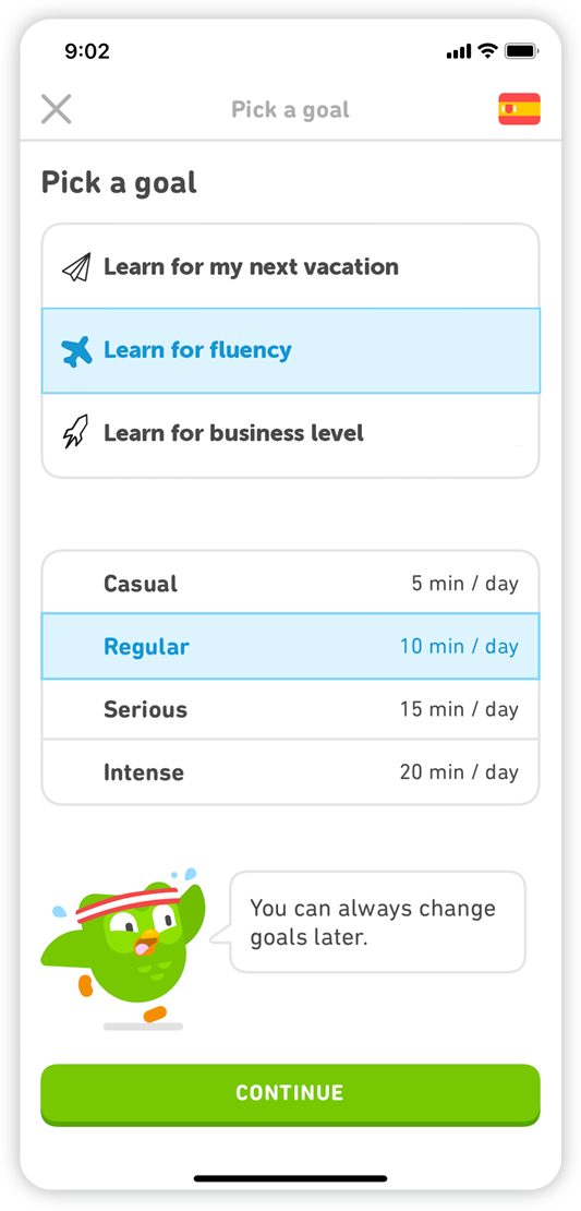
Introducing new goal options to better acclimate users to three different levels of difficulty: (1) Learning for travel/tourism, (2) Learning to become a fluent speaker, (3) Learning for a business proficiency. The user remains in full control and can change the goal at any time, just like their daily XP goal.

Pain Point #3

“After losing my 80-day streak, I cannot motivate myself to start all over.”

Continuous practice is essential for learning any language. Duolingo will send out daily reminders to catch up on lessons and constantly reminds the user with humorous messages. The goal is to maintain a “streak” by completing lessons every day. However, the user has to start their streak over, even if they miss just a single day, which can be frustrating and demotivating for users with low and high streaks. Unless they get a paid power-up to protect their streak beforehand, a so-called streak-freeze is enabled.

A motivational aspect within the notification system can help to keep such users actively engaged to keep going while enforcing the rules of the game.

Pain Point #4
“I cannot write or memorize the words from my Chinese lessons. I can only recognize them when the app shows them to me, even after months of learning.”

People learn languages on Duolingo intending to speak them. However, writing skills will allow for better learning of the language structure and memorizing of learned content. Duolingo neither offers any writing exercises for learners of east-Asian languages, nor does it provide training on how to use such keyboards. Therefore, the user is forced to use other apps to cover their learning needs, which does not align with the acquired vocabulary in the Duolingo curriculum.

Duolingo should get users started on tracing and writing lessons for east-Asian languages, which will enhance their learning experiences and word memorization by leveraging the touch screen of the mobile device used. In addition, Duolingo should offer keyboard introductory classes for languages, such as Korean, Japanese, and Chinese.

Pain Point #5
“In my Japanese lesson I have to match Kanji (Chinese alphabet) words to the Hiragana (Japanese syllabary) equivalent, but I often don’t even know what the words mean that I am supposed to match.”

Triple-matching exercises for east-Asian languages with different writing system/s to help learners to match each word three times instead of twice: Users will have to match (1) the word, written in the foreign alphabet characters, with (2) the romanization (Hiragana for Japanese), and (3) the translation of the word in the user’s native language.

Match triplets instead of twins when learning languages with different writing systems. In the example above, the user has to match the Kanji (子供) with the Hiragana (こども) and, as a new addition, the English translation (child).
Conclusion

In conclusion, Duolingo is an efficient way to learn new languages, but motivational and experiential aspects are important to keep users learning on the platform on a daily basis. Even small pain points can result in big stepping stones on a path that can demotivate the user to be in opposition to Duolingo's mission statement of daily language practice to proficiency. This case study may help to diminish certain pain points significantly.
 
Duolingo can benefit from the outcome of this case study by using the collected information in future updates. These improvements can increase the user base, revenue, and gain a competitive edge.
 
The other beneficiaries are the users themselves, as these solutions increase the user experience exponentially by increasing the value of gamified learning, yet challenging them enough to not lose interest in learning. Further, this case study aims to reduce the number of apps being used, servicing the users’ needs in one place, and the solutions above would augment their metrics.
 
Only constant consumer input and consumer listening to on Duolingo’s end can lead to increased engagement, making it a win-win for both parties.

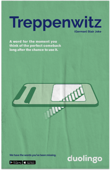
Appendix: We have the words you've been missing - Campaign Concept for New Users

“I have considered using a language learning app, but I have never actually installed because it feels like a big commitment.”

The United States is known as the melting pot of the world. With those living in her borders coming from all walks of life. Many Americans are proud of there heritage but often only speak one language. Duolingo is here to change that.
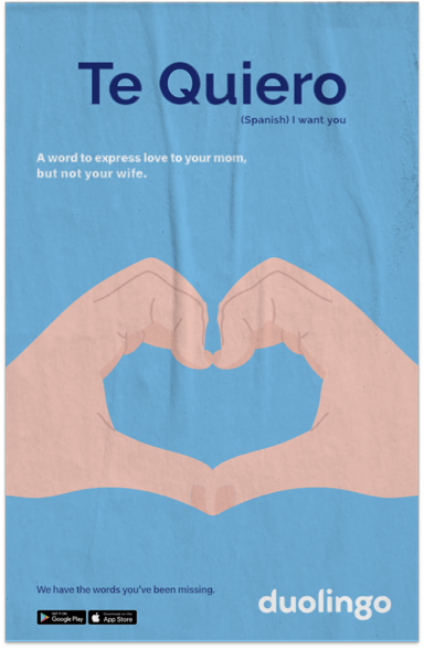
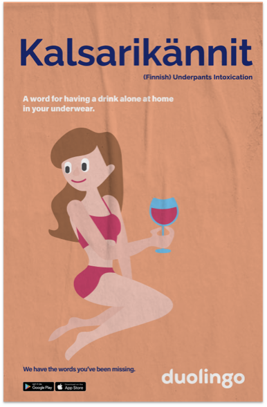
The poster campaign features unusual words in other languages in a playful way.
 The tagline “We have the words you have been missing” wants to waken the curiosity of the viewer about other languages in a fun and engaging way.

Team:
Julian Brueggemann

UX Design, UX Researcher, Illustration
 
Brendan Mansfield
Art Director (Advertising), UX Research Assistant
 
Harvey Gillet
Copy Writer

References:
Catasus y Brueggemann, Julian. “Duolingo-Stepping Stones of Gamified Language Learning.” Medium, 18.10.2020 Opens External Link in a new Window or Tab

Please note: This is a classroom project purely for educational purposes and I do not claim any textual information or photos.

Last Updated: October 18, 2020

Next Project
AMNH Digital Wayfinding

Over the years, the American Museum of Natural History (NYC) grew significantly. As a result, navigation became more complicated for visitors.